八睡眠成立于 2014 年,是一家“睡眠健身公司”,设计产品、内容和工具,以帮助人们更好地睡眠,以实现每天的最佳表现。 他们的第一个产品是智能床,称为 Smart Bed,它允许用户跟踪他们的睡眠模式和生物特征信号,并具有集成的加热器和智能警报,可以在睡眠周期的最佳时间唤醒你。 他们的最新产品 The Pod 通过个性化温度调节、更深入的分析等功能最多可容纳 11 件东西——在《时代》杂志评选的今年最佳发明中获得提名。 今年早些时候,Eight Sleep 推出了由纽约 Interesting Development 设计的新标识。
全面更新,包括新的标志、网站、包装和广告,将八睡从床垫公司转移到睡眠健身公司。 借用运动品牌的线索,新的身份与床垫类别的主要可爱和简单的声音形成鲜明对比,并为自己创造了一个全新的类别。 重新启动后,Eight Sleep 立即获得了 4000 万美元的额外资金,并被《时代》杂志评为 2019 年最佳发明之一。
Interesting Development project page
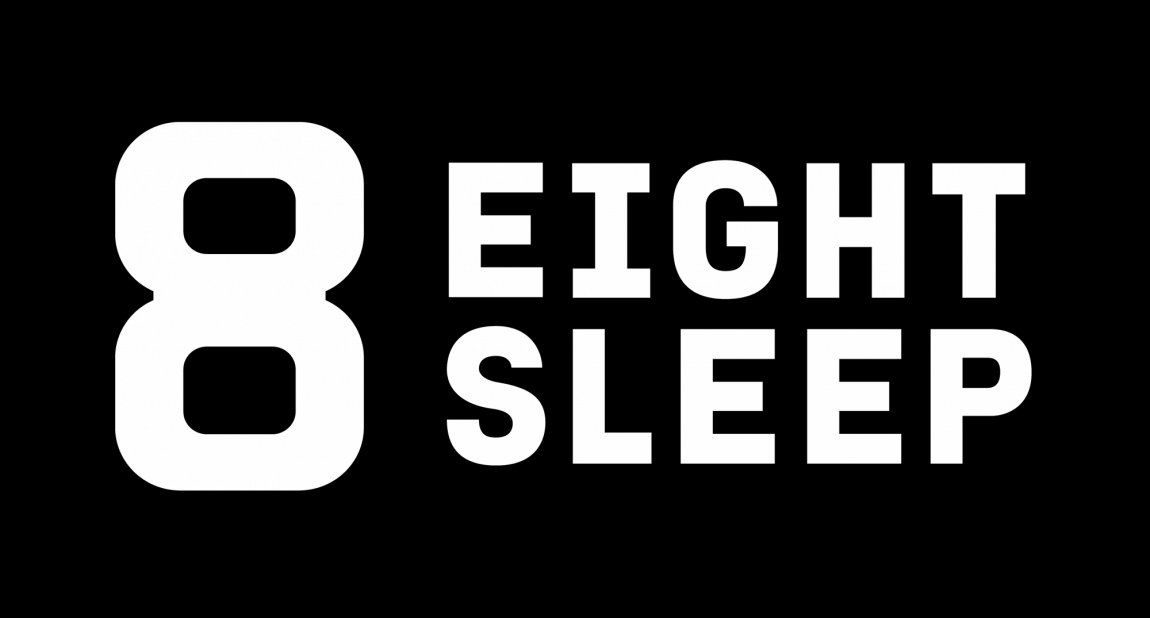
Logo.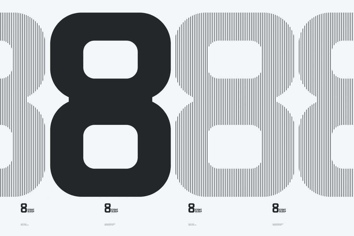
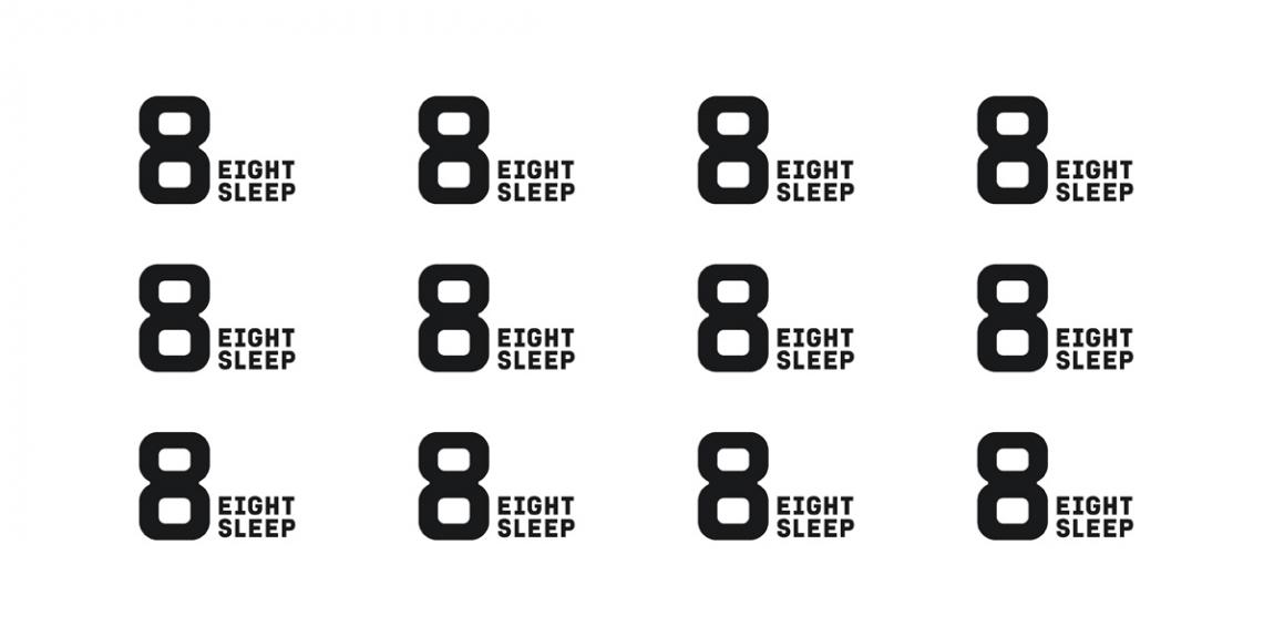
Other logo expressions.
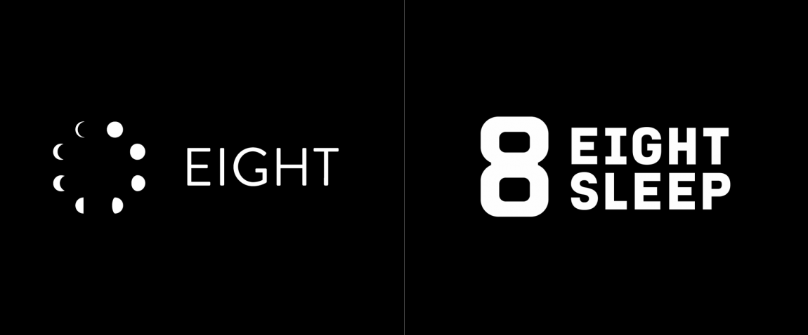
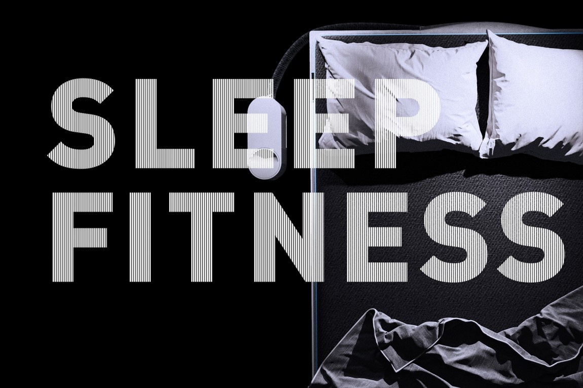
旧的标志相当不错,八个月相排列成一个圆圈,甚至看起来像一个时钟,并且带有一个体面的字标。当然这并没有错,但随着公司改变定位以更符合健身的概念,旧标志并没有传达出新标志更有效的那种硬核睡眠方式。大胆、勤奋的“8”看起来像是属于 CrossFit 健身房的东西,它的结构很厚,看起来就像地狱的双壶铃。我喜欢。我一直在争论我是否喜欢加厚的中间部分——主要是因为这不是“8”的绘制方式,因为中间部分在视觉上应该与顶部和底部笔划的粗细相同,但也许这就是赋予它一些额外区别的原因。字标从每个单词中具有相同数量的字符的名称中受益匪浅,允许它以整洁的等宽方法排版,看起来很棒,并与“8”形成紧密的锁定。不同的锁定和条纹版本的标志是很好的扩展,以获得更多样化的外观——我希望看到一种更简洁的 IBM 式条纹方法,也许一次增加 8 个条纹的变化,对于更多的机械氛围。
Type treatments.
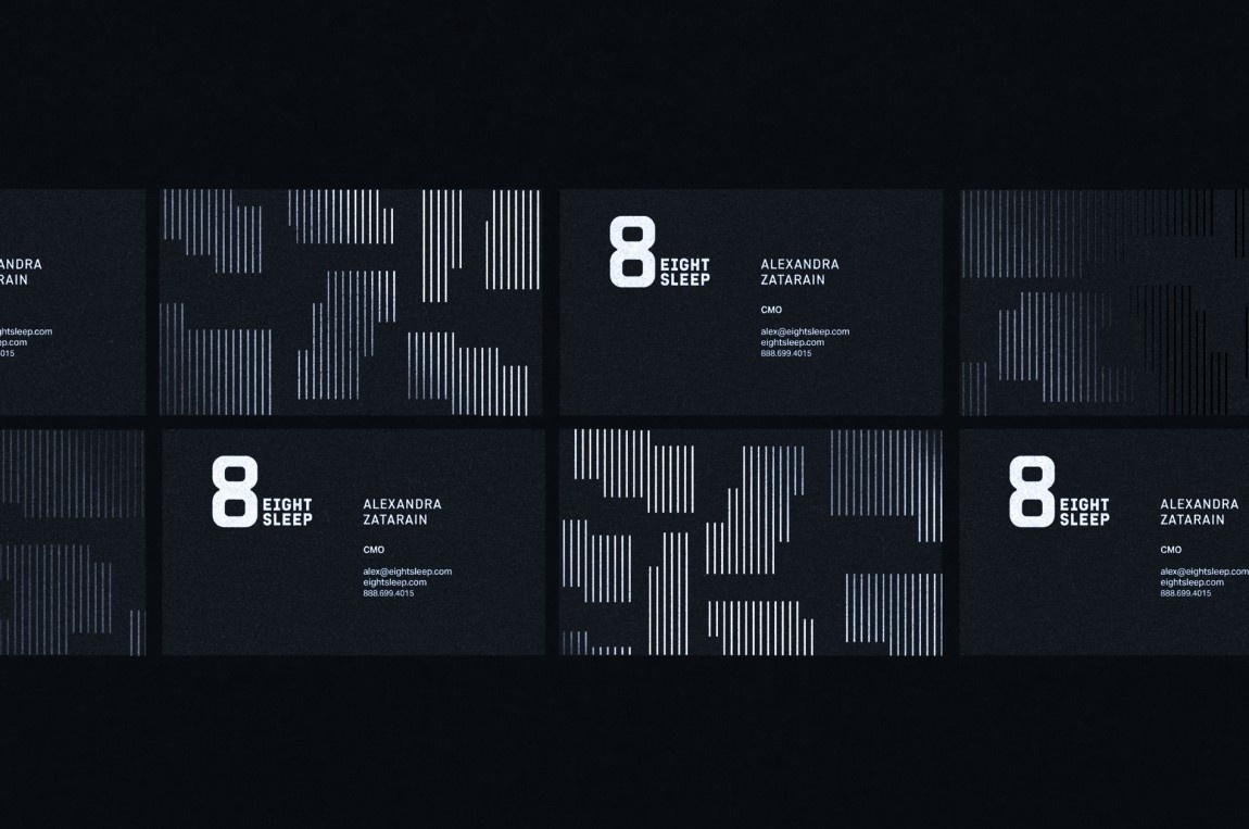
Business cards.
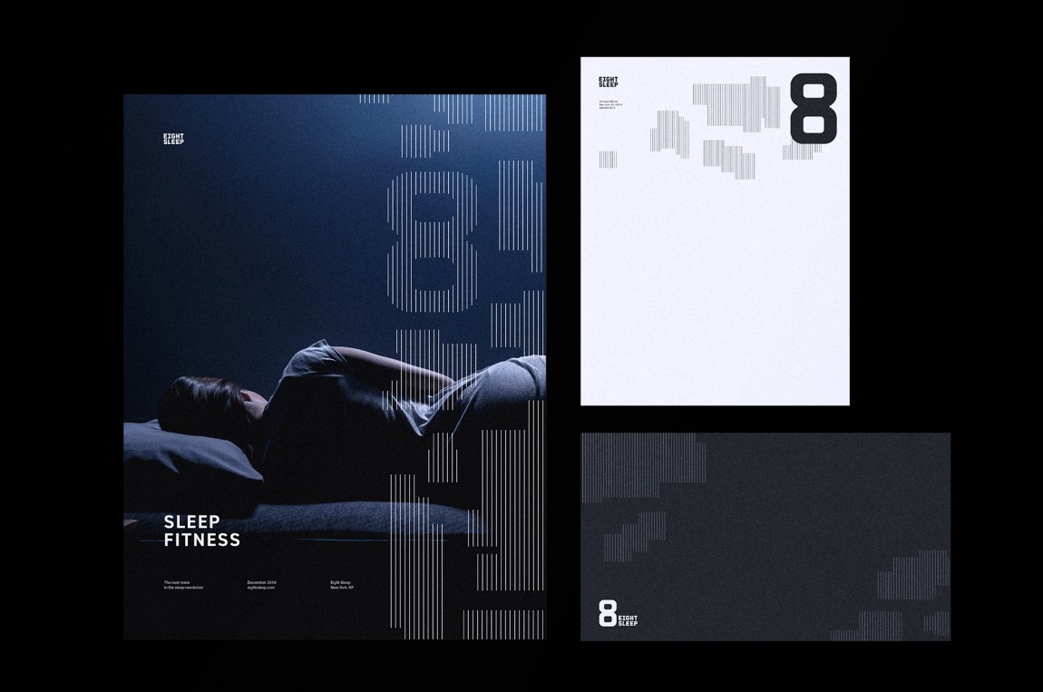
Letterhead and some other stuff.
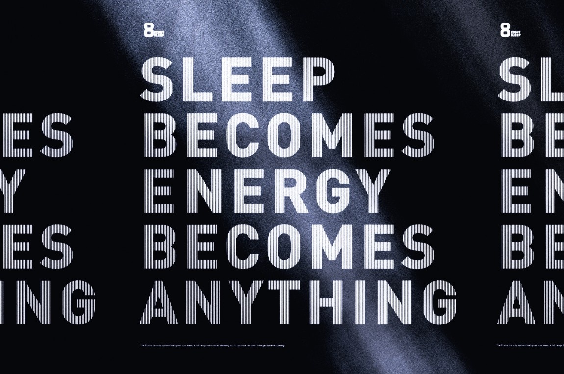
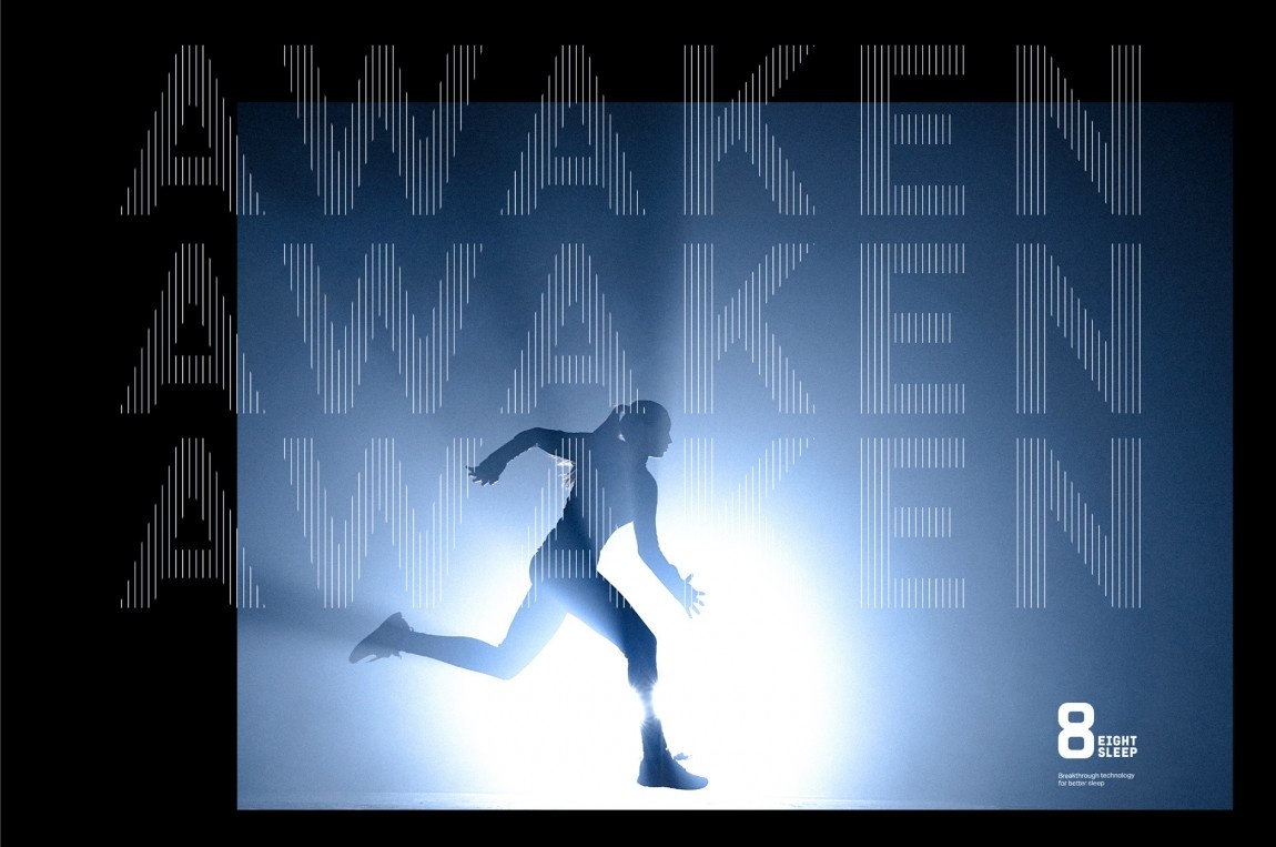
在应用程序中,有很多条纹,它开始变得有点混乱和不同,特别是在它们在排版中的使用时,从太厚和彼此靠近到太薄并且彼此分开——它们都很有趣但 他们有如此不同的氛围,我认为坚持其中一个会是有益的。 整个身份中还有抽象的、类似俄罗斯方块的条纹片段,我有点喜欢,但也有点不喜欢。 这是一个很好的设计元素,但它的部署在某些地方并不完全正确。 尽管如此,这一切或许确实传达了数据和进度的概念,就像跑步机和固定自行车上的条形图一样。
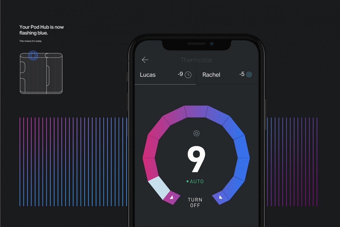
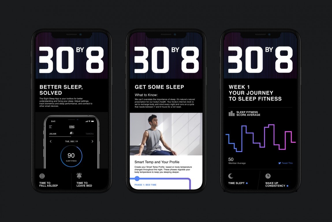
App.
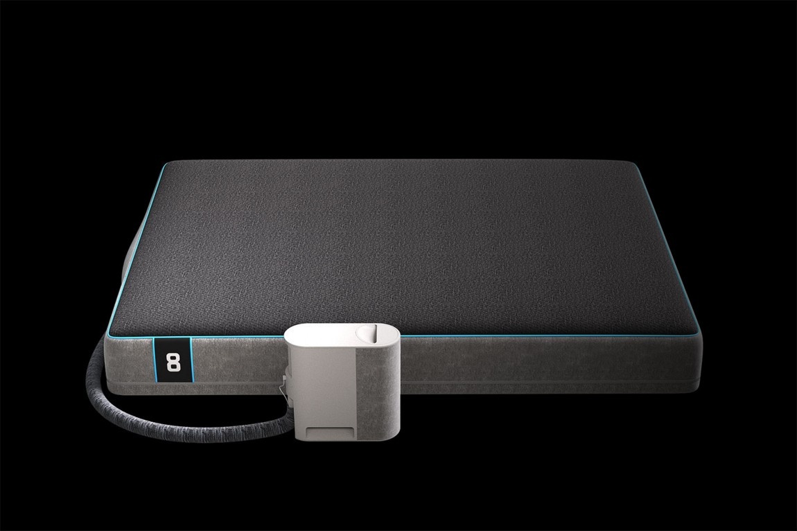
“The Pod” bed.
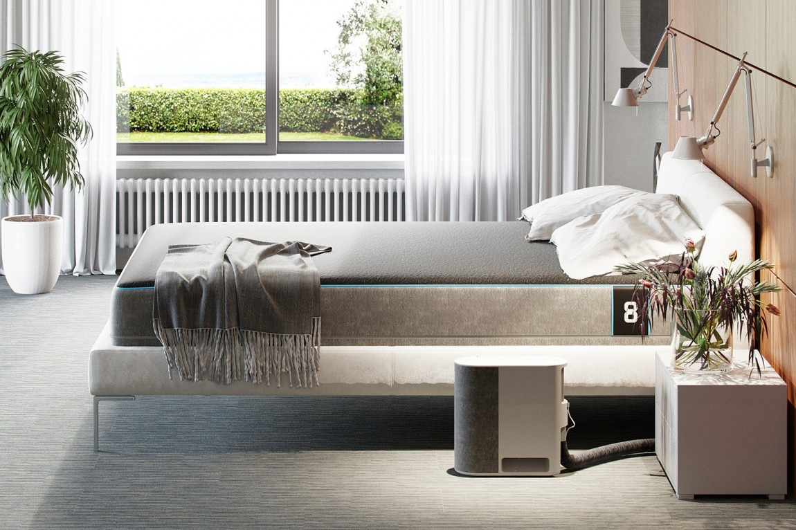
The Pod in situ.
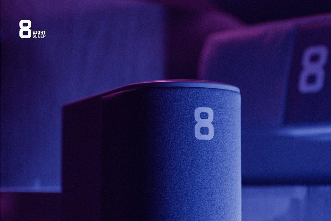
The Pod up close.
The Pod up close, dramatically.
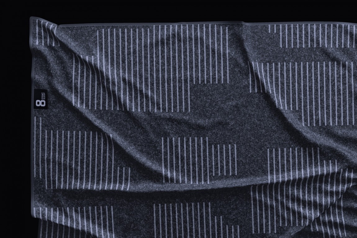
Blanket.
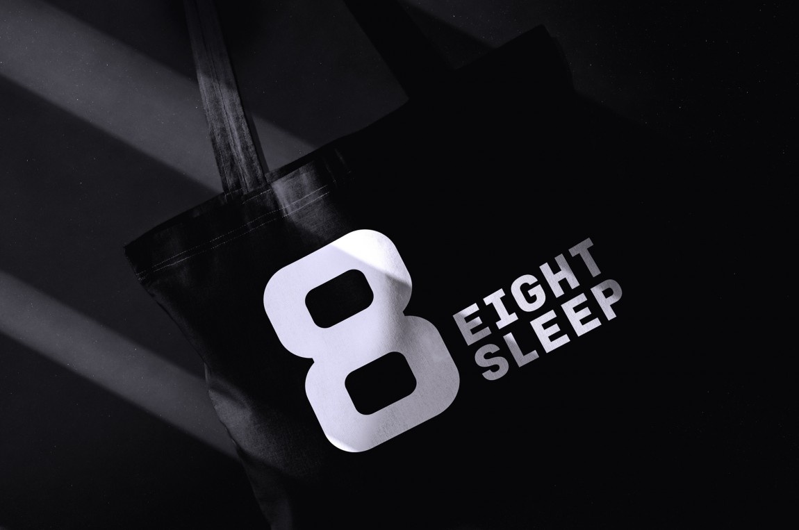
Tote.
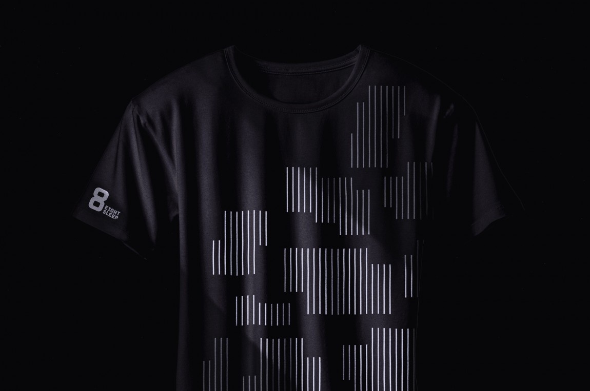
T-shirt.
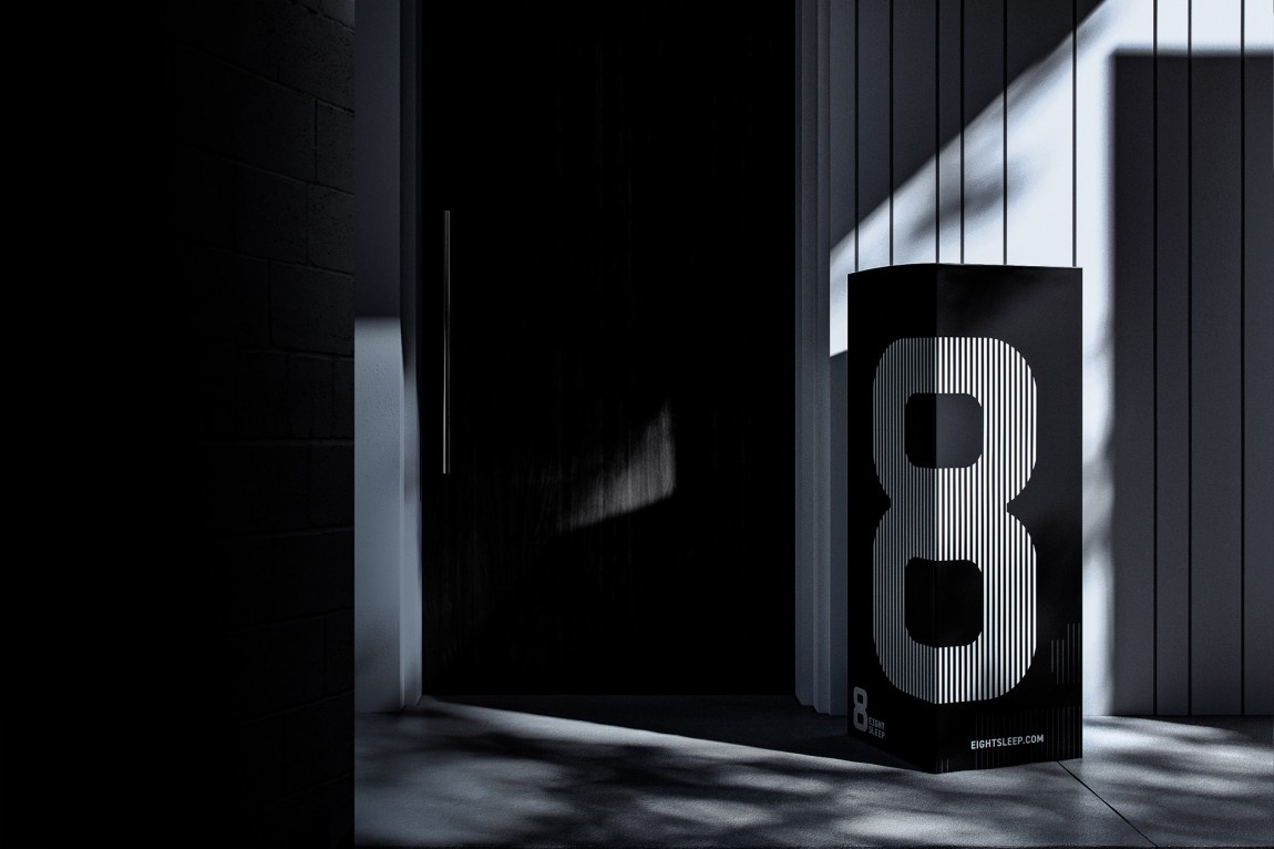
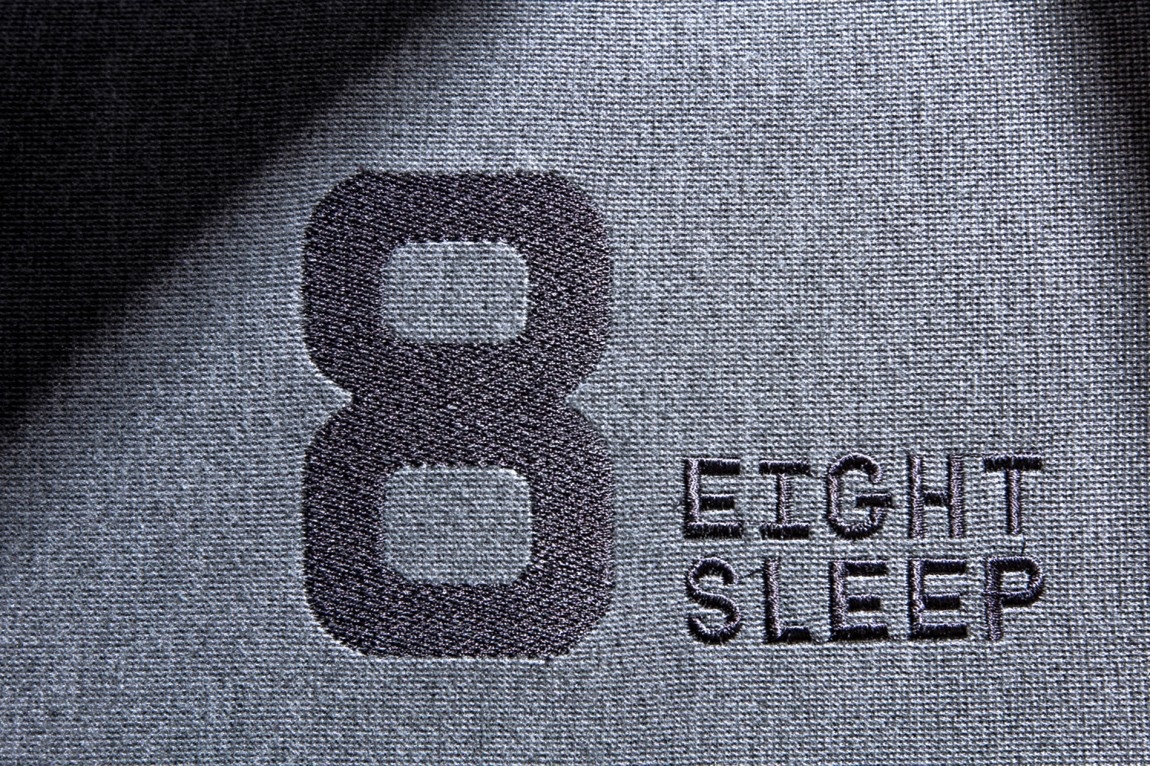
Mattress box, hero shot.
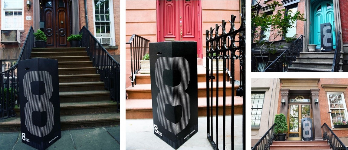
Mattress box, in real life.
那个带有大“8”的黑盒子非常糟糕,作为其整个黑色背景、高对比度、大胆美学的一部分,它与最近饱和的邮购床垫市场与竞争对手建立了一个非常强的区别点 像 Casper 和 Purple 一样,通过瞄准具有健康意识和痴迷于健身的人群,这种身份是为其做好准备的。