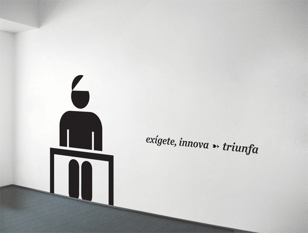
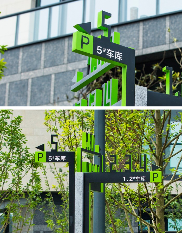
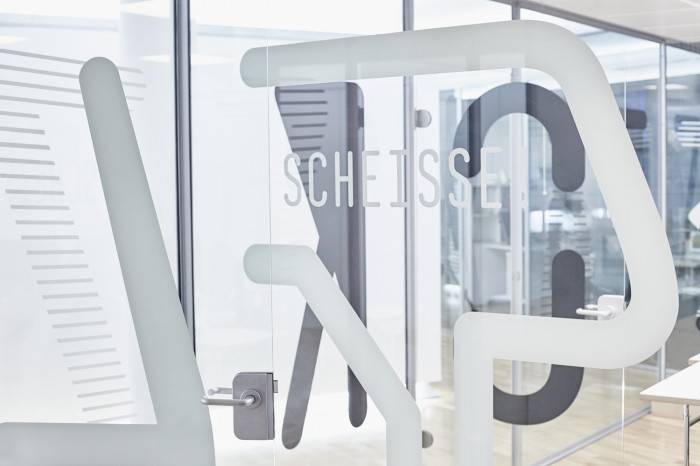
乐高公司创办于丹麦,至今已有85年的发展历史。商标“LEGO”的使用是从1932年开始,其语来自丹麦语“LEg GOdt”,意为“play well”(玩得快乐),并且该名字首先迅速成为乐高公司在Billund地区玩具工厂生产的优质玩具的代名词。设计师从乐高企业自身的产品特点出发,设计出生动有趣的公告栏设计。


导视系统设计,导视牌设计,环境导视设计,标识标牌设计,标牌标识设计

乐高公司创办于丹麦,至今已有85年的发展历史。商标“LEGO”的使用是从1932年开始,其语来自丹麦语“LEg GOdt”,意为“play well”(玩得快乐),并且该名字首先迅速成为乐高公司在Billund地区玩具工厂生产的优质玩具的代名词。设计师从乐高企业自身的产品特点出发,设计出生动有趣的公告栏设计。
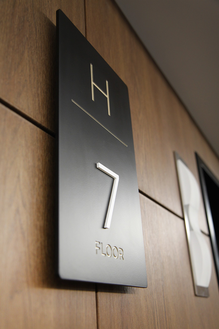
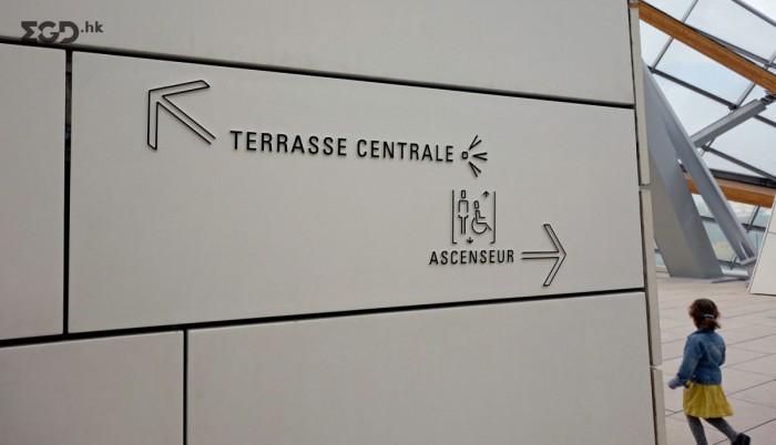
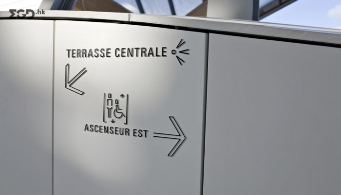
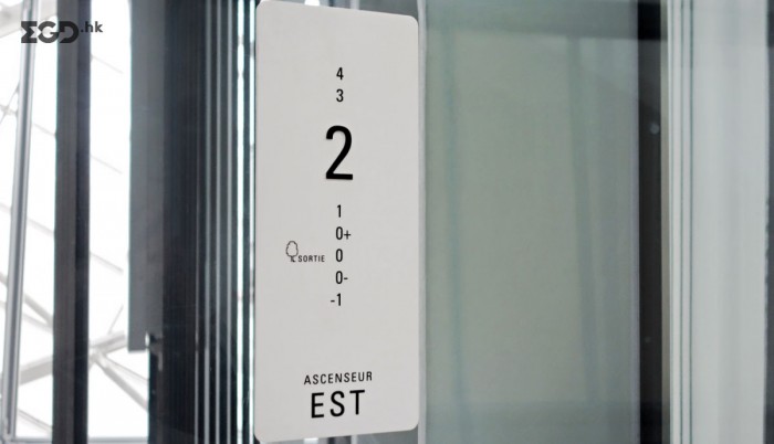
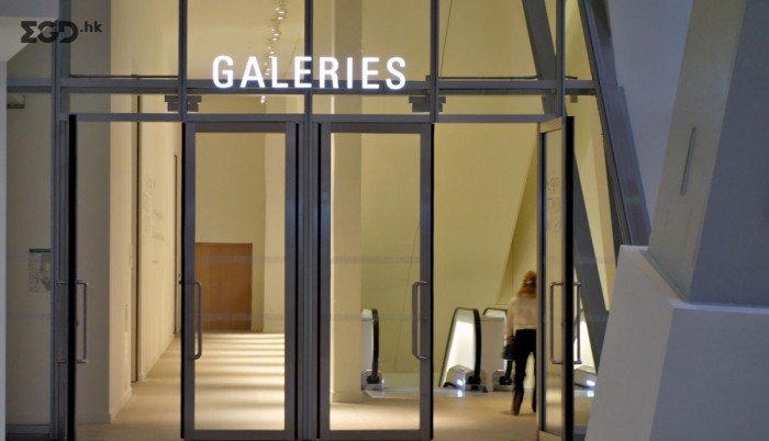
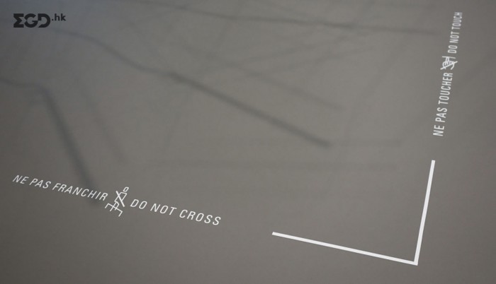
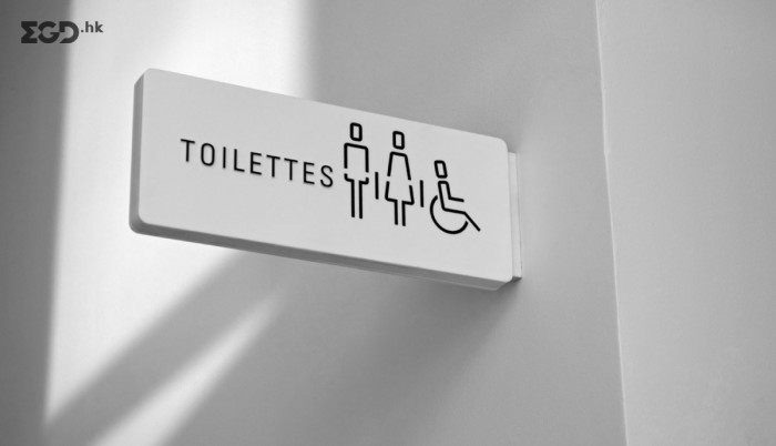
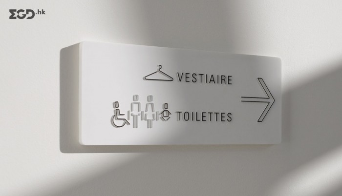
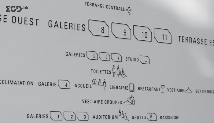
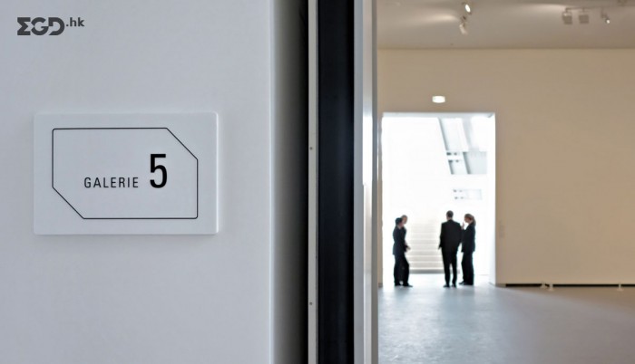
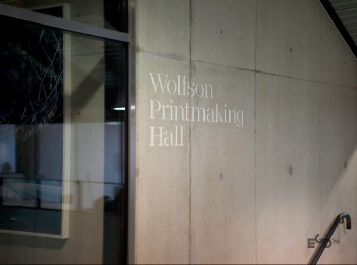
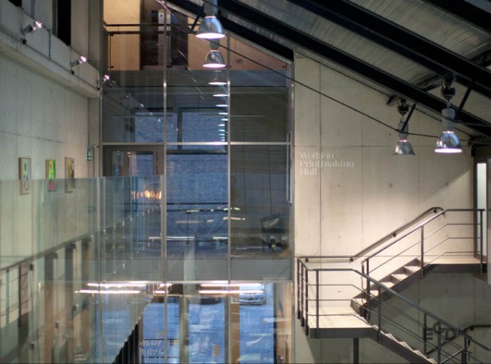
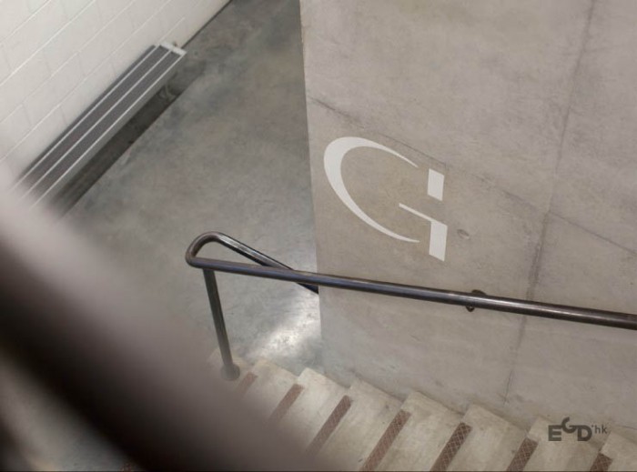
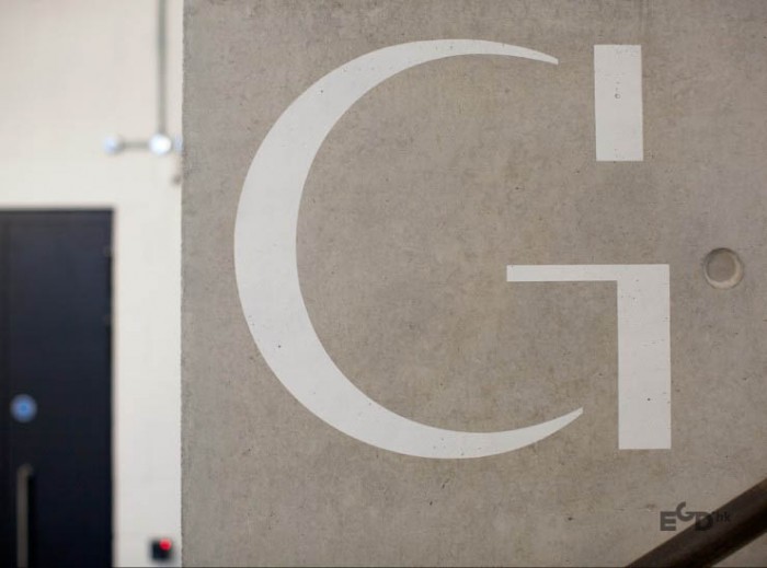
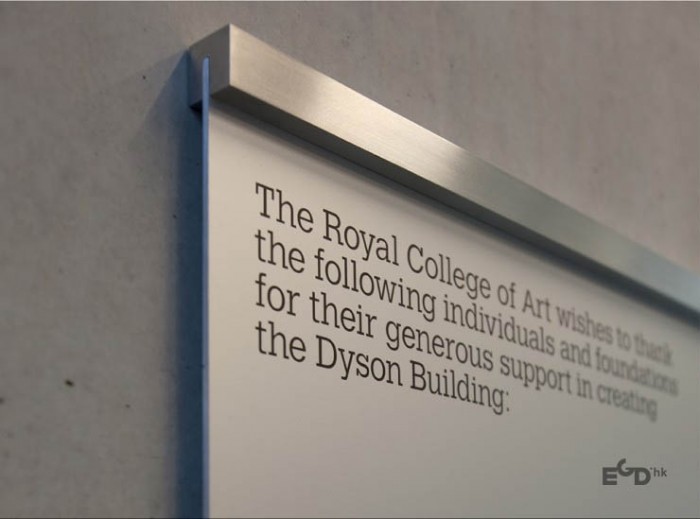
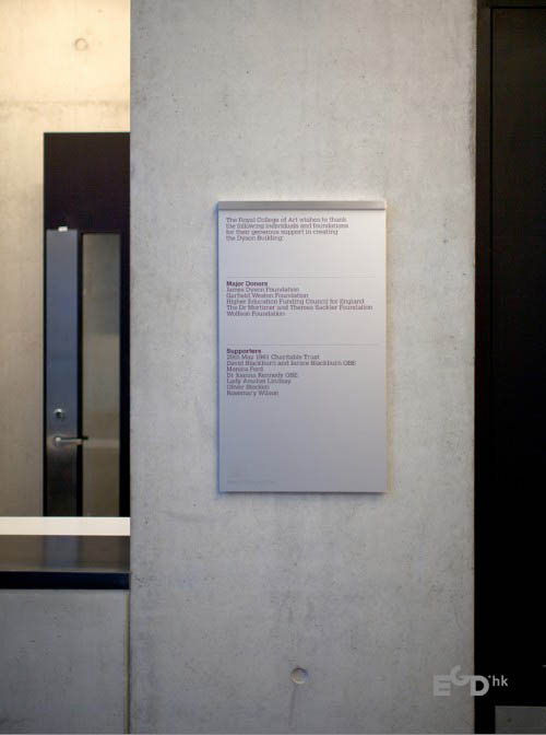
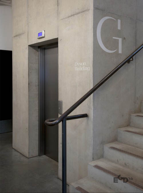
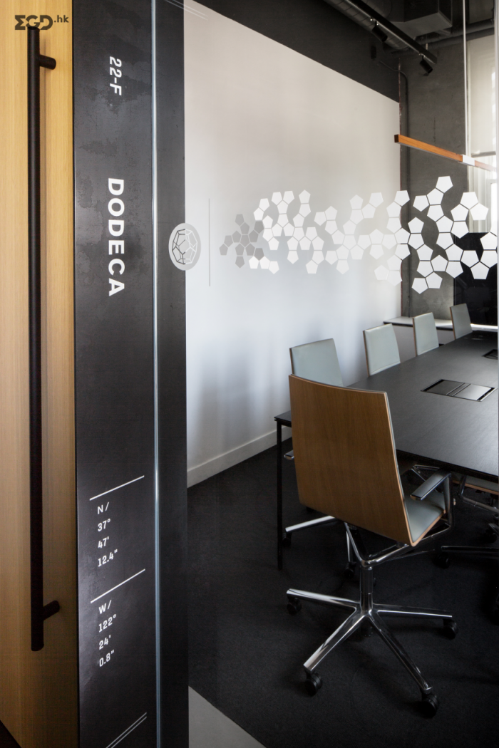
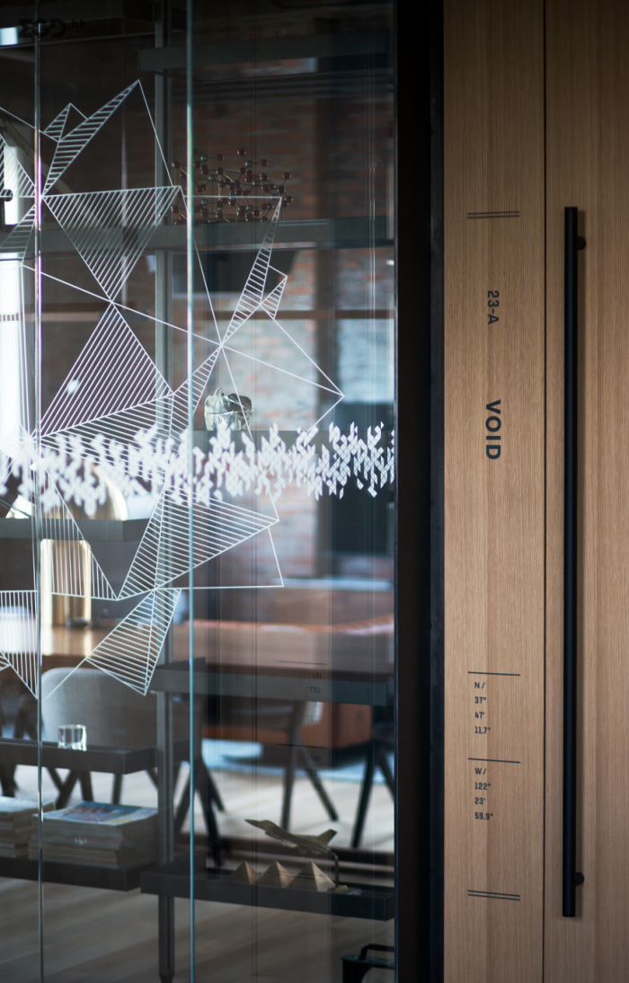
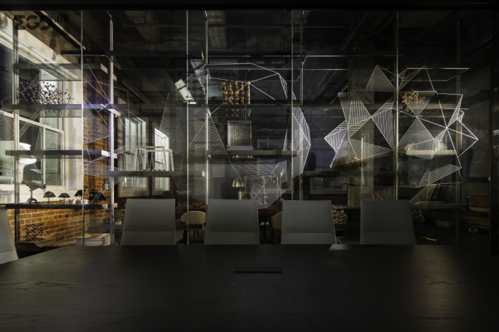
皇家艺术学院成立于1837年,世界最著名艺术设计学校之一,也是世界上唯一在校生全部为研究生的艺术设计学院,学院坐落于伦敦,课程讲授者均为国际知名艺术家,从业者和理论家。皇家艺术学院拥有国家最先进的设施和优秀的研究资源,并且有促进优秀创意和智慧的环境。Cartlidge Levene委命为其创造环境指示系统。以下为Cartlidge Levene官方项目介绍。
The Royal College of Art is the world’s most prestigious and influential postgraduate art and design school.
We have been appointed to design the wayfinding and signage for all of the Royal College of Art buildings, comprising of two London sites in Kensington and Battersea. The project will be rolled-out in phases completing in 2015.
The first phase was installed in the new Dyson Building in 2012. Located in Battersea, the Dyson Building, by architects Haworth Tompkins, unites the Fine Art disciplines for the first time in the College’s 175 year history. It also houses a 220-seat lecture theatre, an exhibition gallery and ‘InnovationRCA’.
A key part of our brief was to design a common signage design language to unite wayfinding information across a diverse range of building types. These include the industrial workshop aesthetic of the Battersea campus and the eclectic mix of architectural styles in the Kensington campus ranging from the 1960s Darwin Building to the Georgian Queen’s Gate Building.
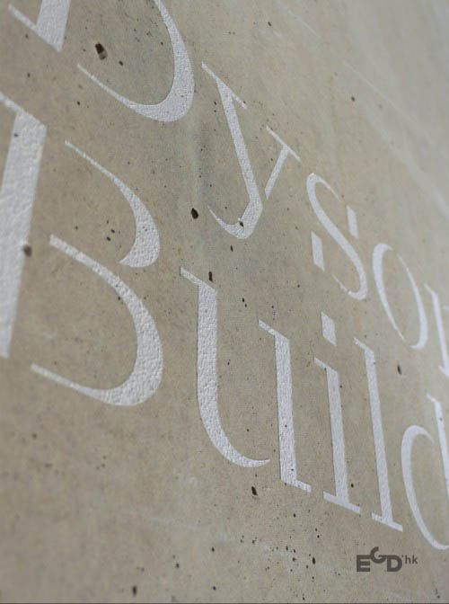
Our wayfinding strategy incorporates two layers of signage: an updateable element to provide flexibility as more space becomes available in Battersea and a permanent element, consisting of hand-painted lettering, used for information such as building names, level numbers and donor recognition signage.
Our design utilises the new Royal College of Art brand, designed by Research Studios. Our core fonts are ‘Calvert’ – first used by the College in 1992 and ‘Calvert Brody’, a new font created by Neville Brody, Margaret Calvert and Henrik Kubel. The stencil characteristic of ‘Calvert Brody’, suggests cutting and tactile treatments and we have reserved its use for permanent information where we can carve and embed type into
the building.
The Battersea campus is being further extended to include the Woo Building, which is due to open in 2014. Final redistribution of programmes between the Kensington and Battersea sites will be complete in 2015.
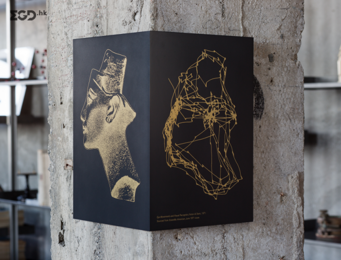
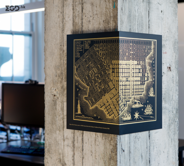
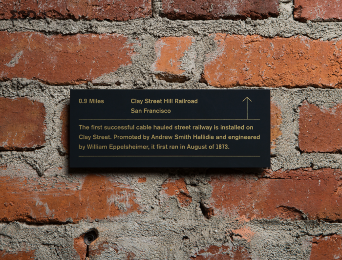
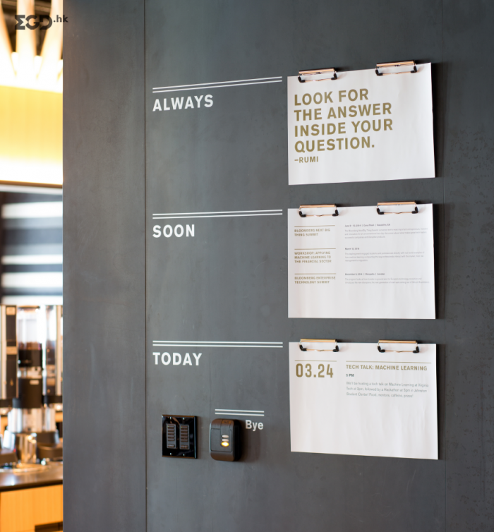
For their new tech hub in San Francisco, Bloomberg wanted to create a space that embodied their status as an established and innovative technology company. No ping-pong tables, silkscreened inspirational posters, or playroom-inspired spaces. Bloomberg is not a startup, but a mature leader in the technology space.
Situated in the art deco 140 New Montgomery building, Iwamoto Scott’s space design honors its history yet is also modern and sophisticated. Volume extended its narrative through a visual identity of wayfinding and environmental graphics.

青山湖森林硅谷导视系统由设计师严少伯分享于behance。青山湖国际智慧城,临安115平方公里青山湖科技城的核心区位,总占地29平方公里,由美国SWA、STUDIOS、IBM等业界巨擘联手打造,采用世界最先进理念,规划六大产业聚落,融金融、科技、商务、文化、度假、服务于一体,建立完善的自我运营体系。


克赖斯特彻奇在2010年和2011年遭受了一系列地震,造成了生命损失和城市的广泛破坏。坎特伯雷大学的校园受到严重影响,引发了许多建筑物的修复工程和新的建筑项目。这意味着许多学生将完成他们在大学的全部时间,而大部分校园是一个建筑工地。这所大学希望让不断变化的环境看起来充满活力,欢迎学生、工作人员和参观这座庞大而复杂的校园的游客。当各种建筑物退役、重新开放或建造时,旅行路线将不断改变。建筑围板,用来隐藏建筑工程的视线,是由王冠设计,作为一个画布,激活和振兴校园。他们还被视为一个提供有关建筑物、建筑时间线和设施信息的机会,以及强调大学品牌价值和传达对未来的乐观情绪的机会。重要的是,Diadem的设计能够适应现场不同的位置。这个范围还试图识别和激活可能创造了黑暗的,隧道般的大道的囤积区域。为了适应重建工程所施加的不断变化的路线,设计了一套临时标志结构。石笼结构由岩石填充,可根据需要从一个位置移动到另一个位置。开发了一个多箭头形状和一致字体的图形系统,应用于石笼或围板。该设计是基于简单的经济思想,提供最大的影响,并参与当前和未来的学生。
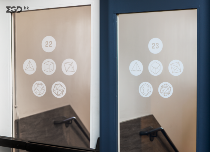
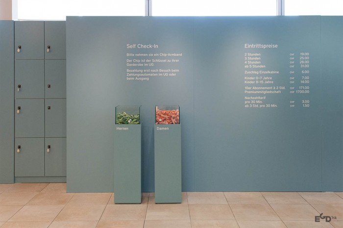
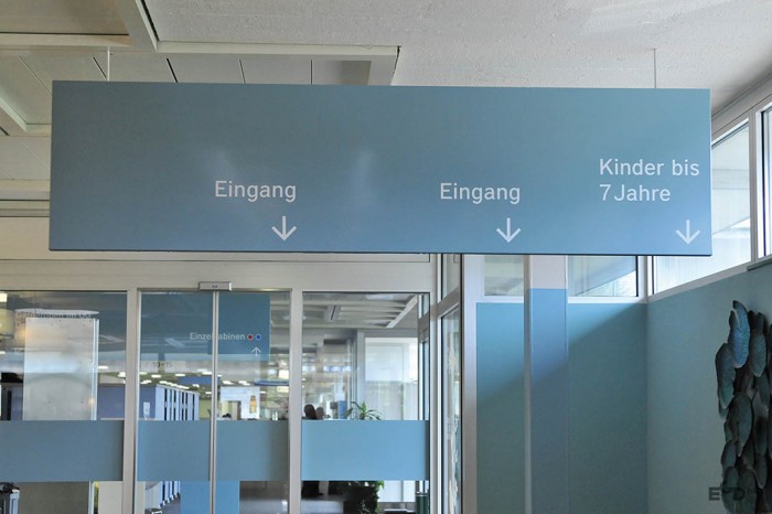
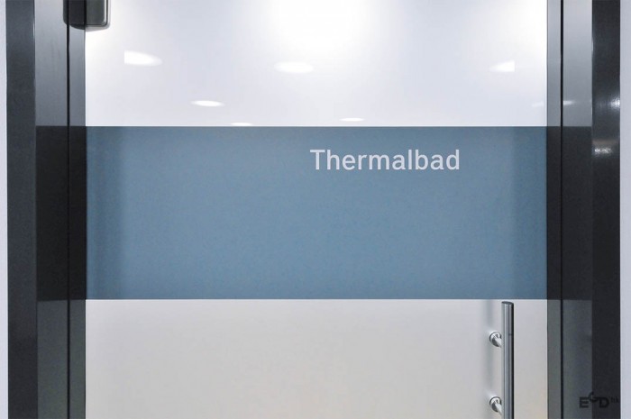
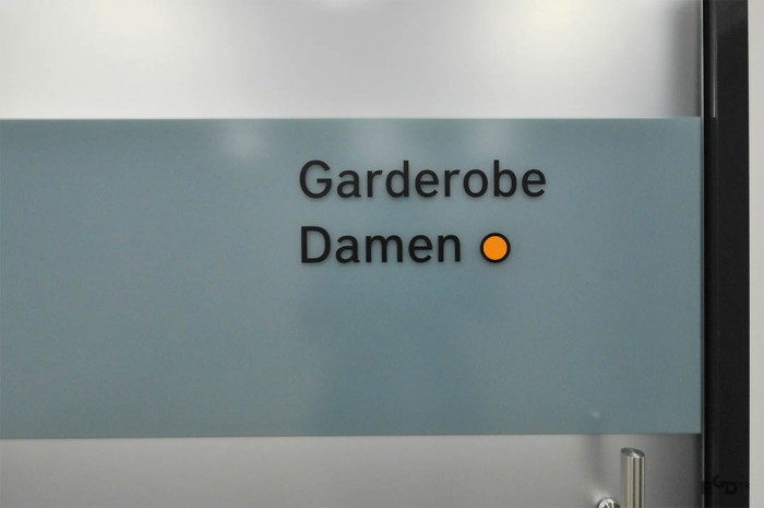
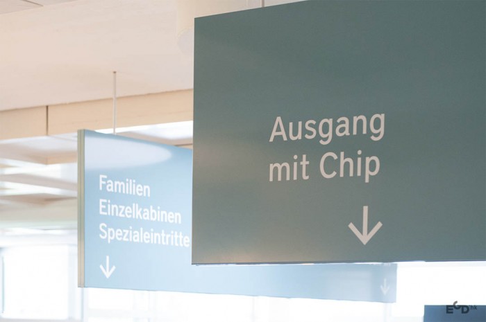
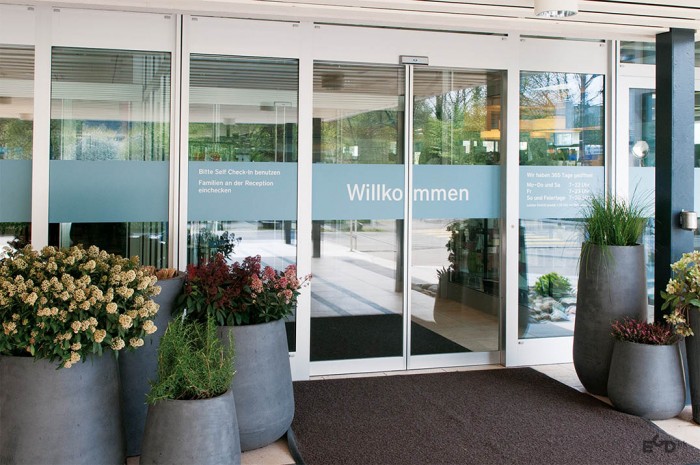
每个周末超过3000人去瑞士楚尔察赫Thermalbad温泉浴场。mifflin-schmid为其规划了一套完善的标牌系统来解决浴场前台和更衣室等区域的人流堵塞。简洁简单显示更为清晰能够快速引导及疏散客人到达目的地。
Over 3000 people visit the popular Swiss Zurzach Thermal Baths each weekend. Congestion at reception and in dressing rooms was to be corrected with improved signage. An analysis of reception staff operations, visitor flow logistics and existing signage inventory made inadequacies apparent. Now, large clear signs and directional panels at the entrance channel visitors smoothly to their destinations. The strong, neutral font “District medium” was chosen for legibility; a calm color scheme was designed to direct attention to key information.


牛津大学学校标识标牌设计图片
作为大学“思考空间”计划的一部分,霍尔姆斯·伍德为屡获殊荣的约翰·亨利·布鲁克斯大楼设计了一个新的寻路方案。霍尔姆斯·伍兹的策略涵盖了信息设计的每一个元素,从位置、内容、命名结构、排版和图标设计到定制的产品设计、采购和安装。该团队与建筑师紧密合作,通过与他们大胆的室内设计方案无缝结合的形状、材料和颜色来创造设计。
牛津大学希望这座建筑和它设计的所有元素都能反映一种新的教学态度,并确保学生和未来的学生感到牛津布鲁克斯不仅现代化了,而且树立了标杆。霍尔姆斯·伍德的团队花了很多时间和利益相关者在一起,他们中的一些人已经在大学工作了很多年,了解了建筑中潜在的问题,并解释了寻路策略与他们的正常方法相比是如何工作的。从一开始,这个团队就决定减少通常安装在大楼里的标志数量,并给学生们专门的区域张贴他们自己的通知。该团队还需要解决连接新建筑和没有同时更新寻路方案的老建筑的问题。Holmes Wood为新建筑创建了清晰的入口,并在过渡区域更新信息,允许人们在新旧校园空间之间移动。
标志形式借鉴了大学品牌和新建筑,并融入了色彩鲜艳的室内设计。定制的象形文字为标识带来了个性和个性,并与大学字体Helvetica协同工作。寻路方案是令人信服的“品牌”,同时看起来与大学采取的激进的新建筑方法有关。
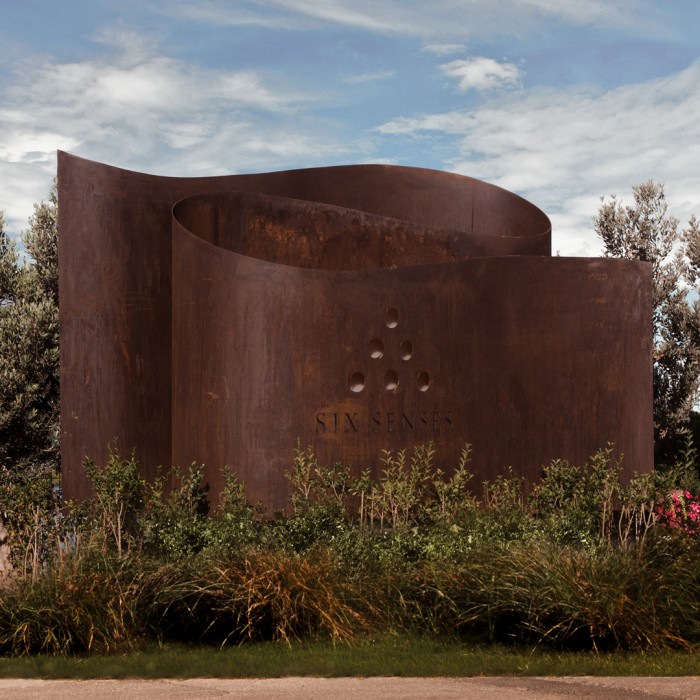
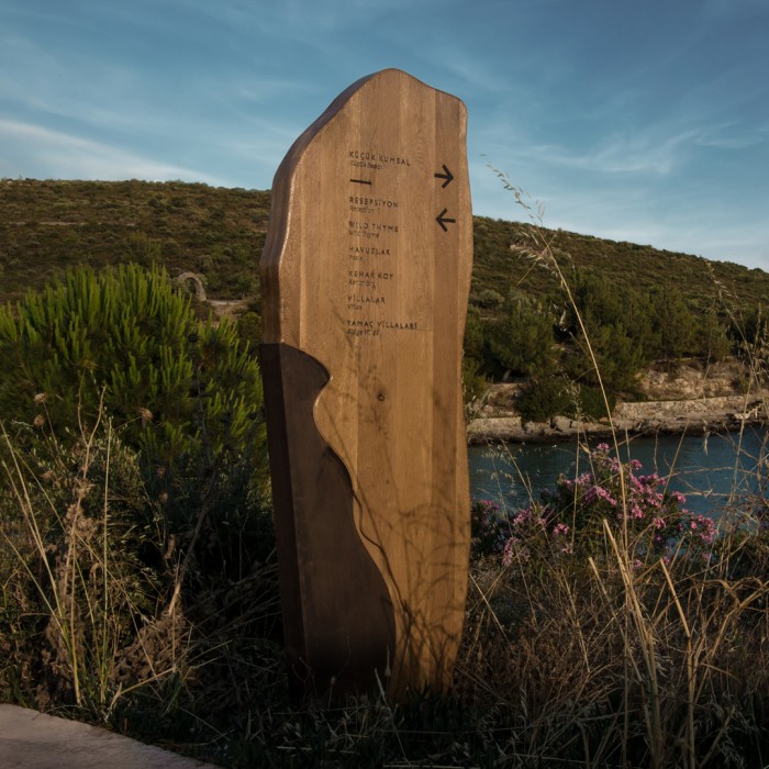
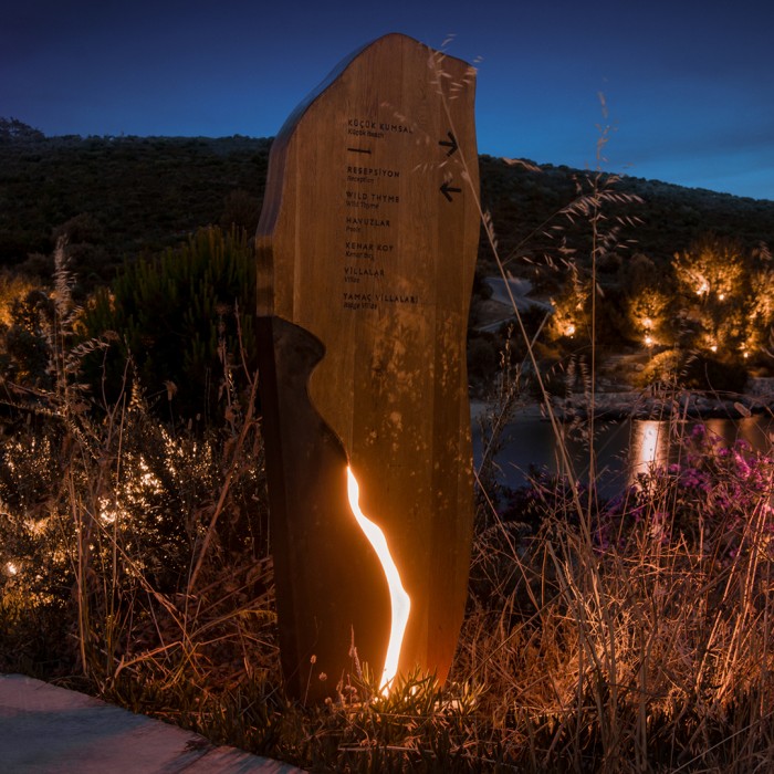
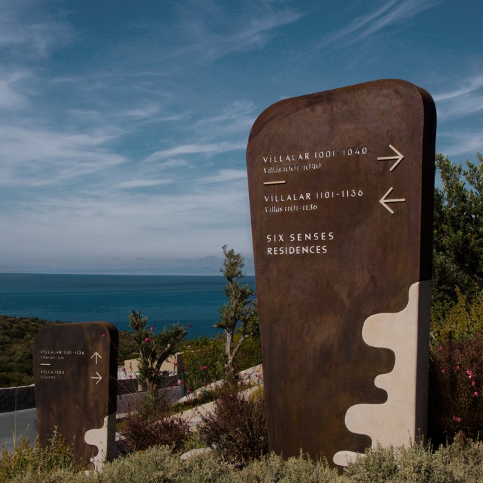
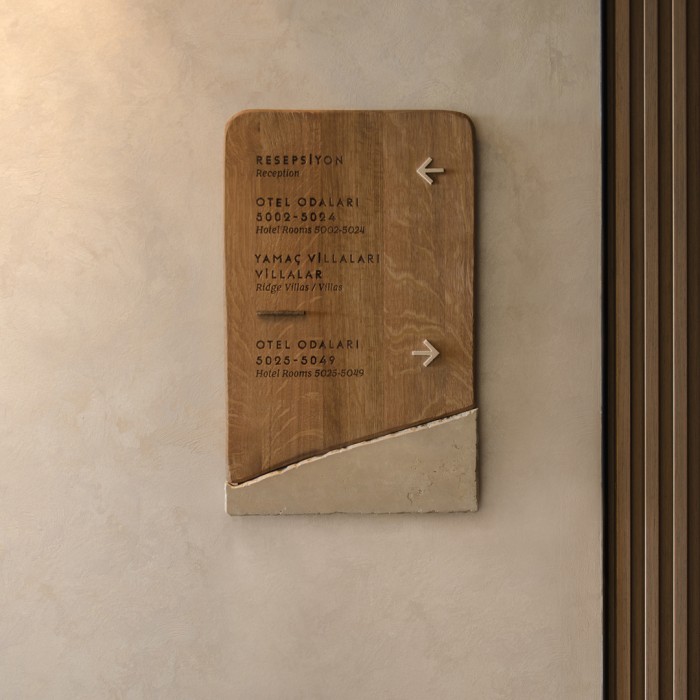
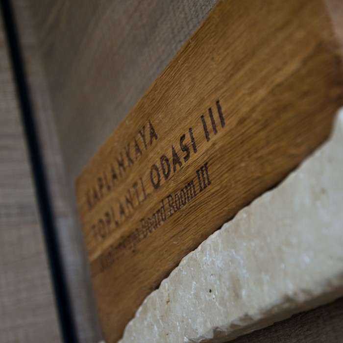
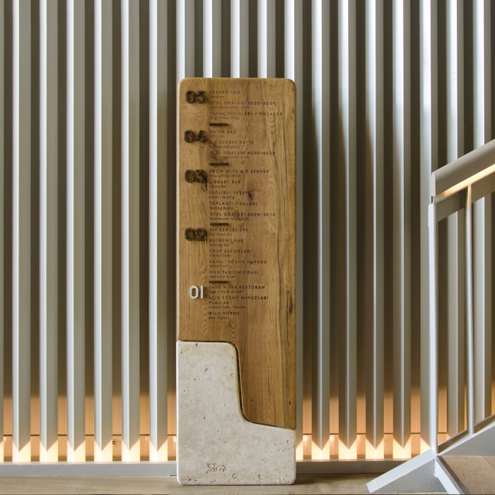
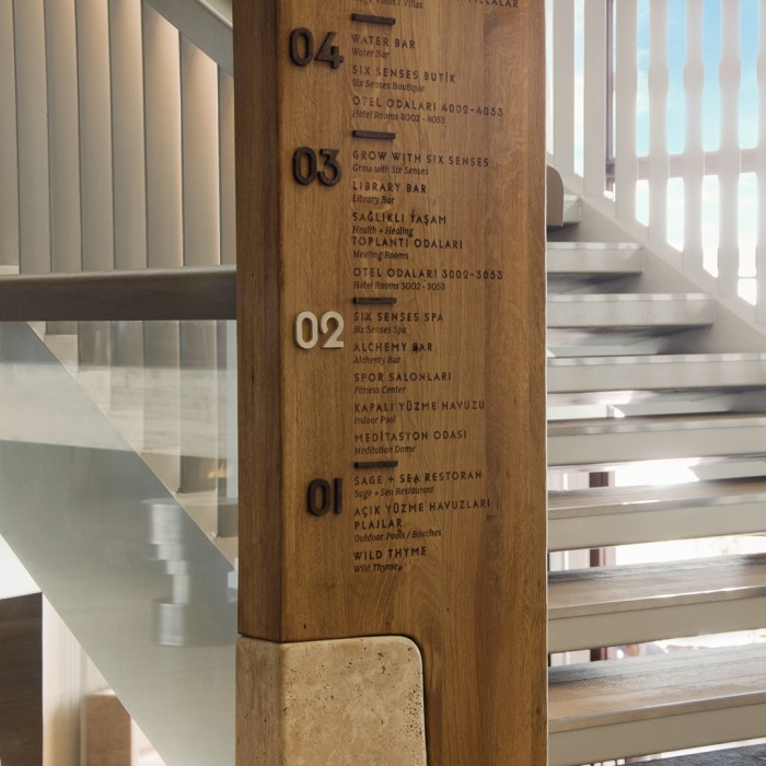
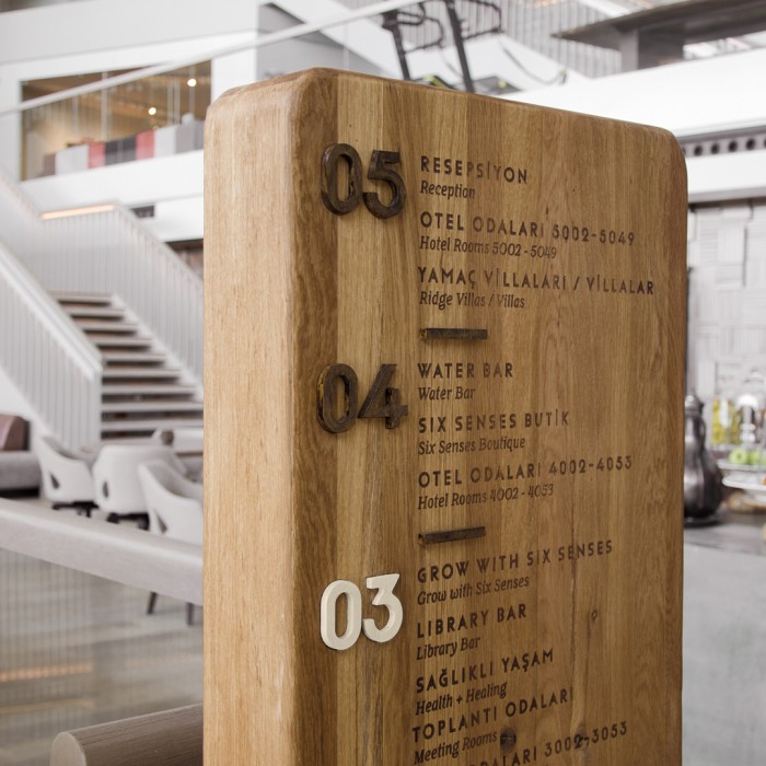
Six Senses Kaplankaya度假村位于爱琴海地区(Aegean Region)的米拉斯(Milas),距离博德鲁姆市(Bodrum City)84公里。该项目由Federation设计机构提供了整个酒店的标识系统设计服务,
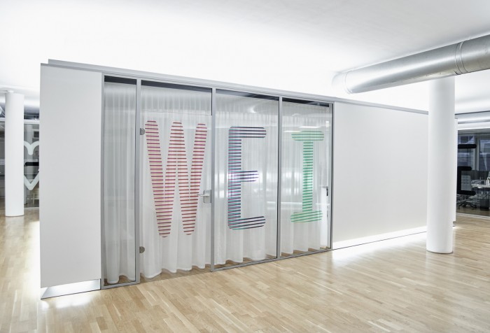
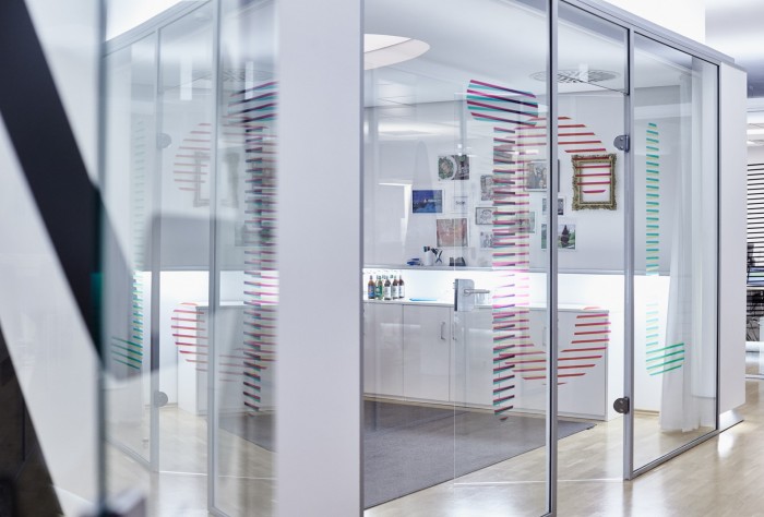
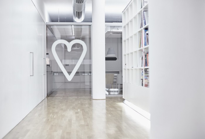
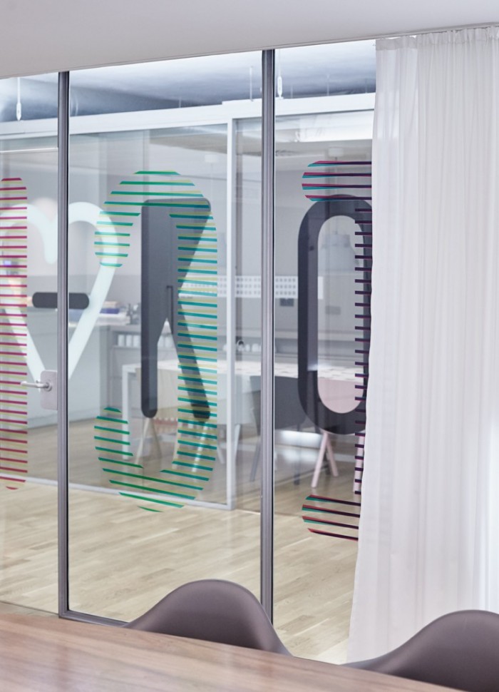
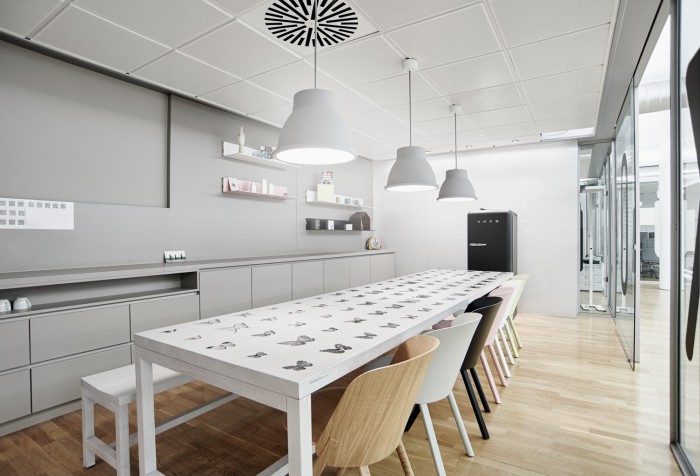
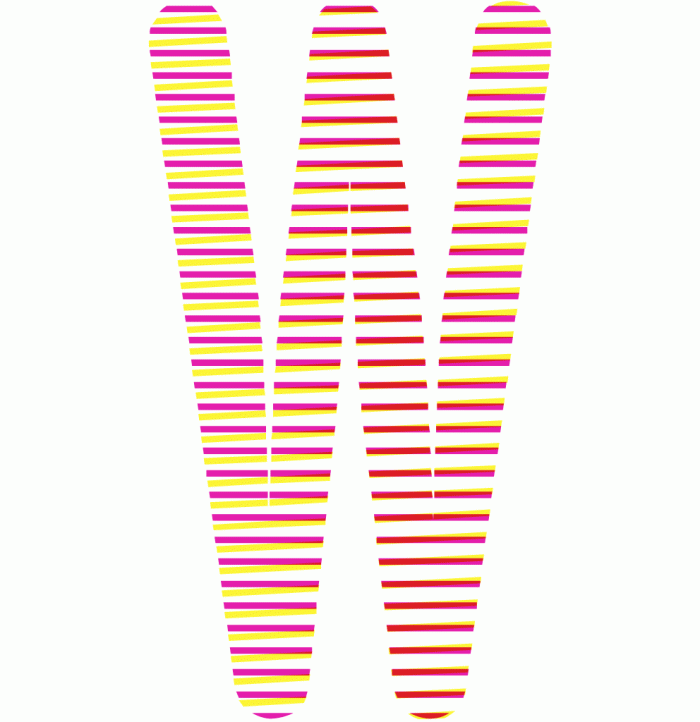
projekttriangle开发了weitclick的环境图形,他们在玻璃上设计了印刷装置,上面有不同的文字和图标,还有一张有近百只仿真蝴蝶的精美桌子。整个空间干净、现代,色彩亮丽,家具美观。

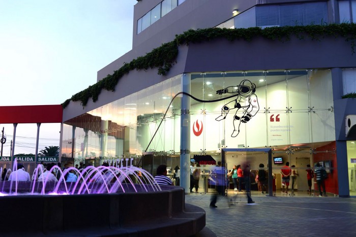
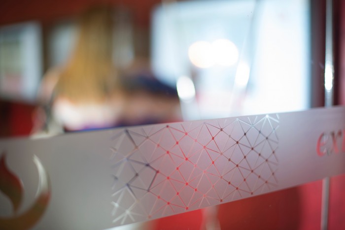
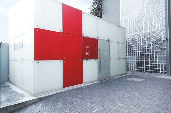
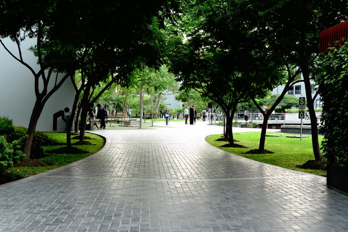
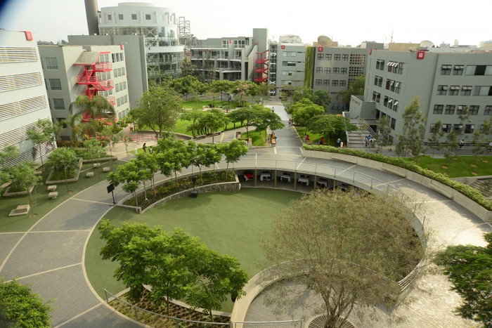
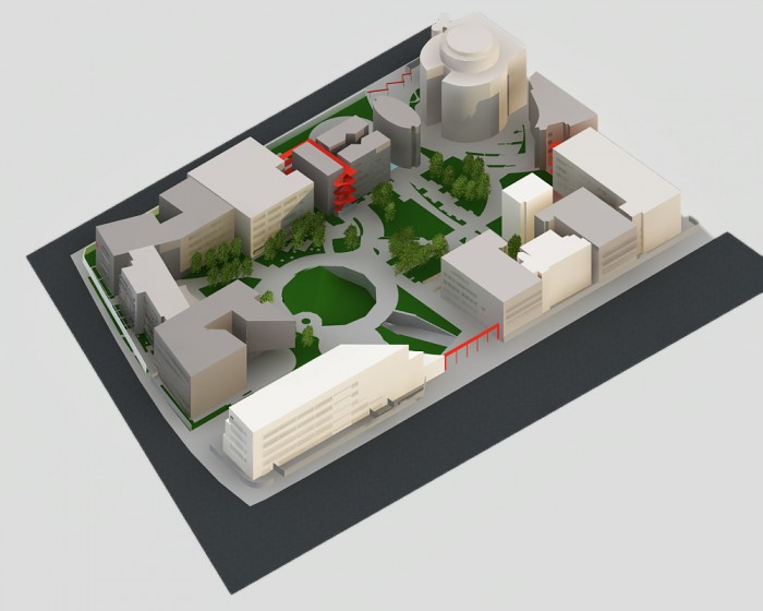
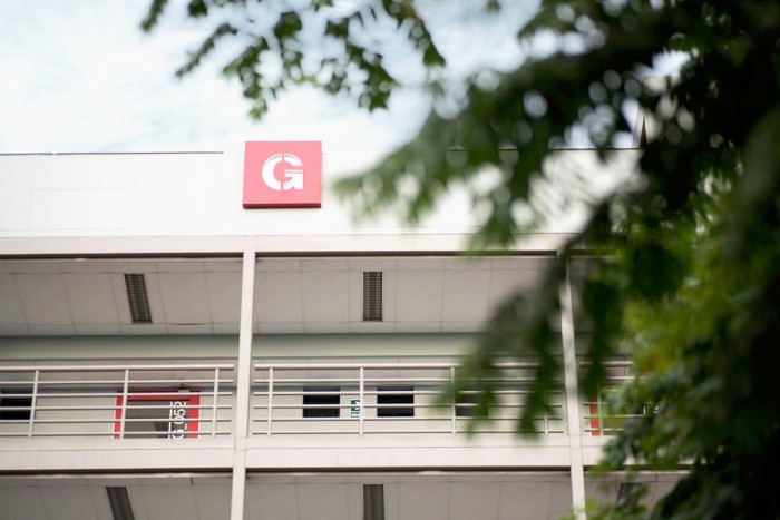
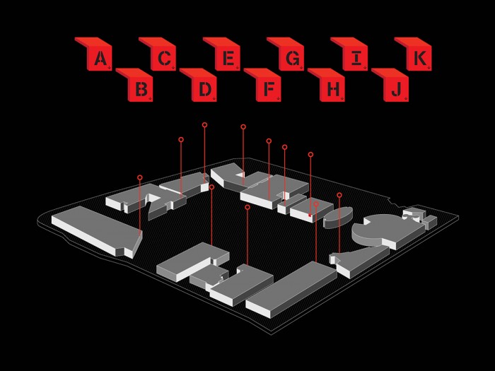
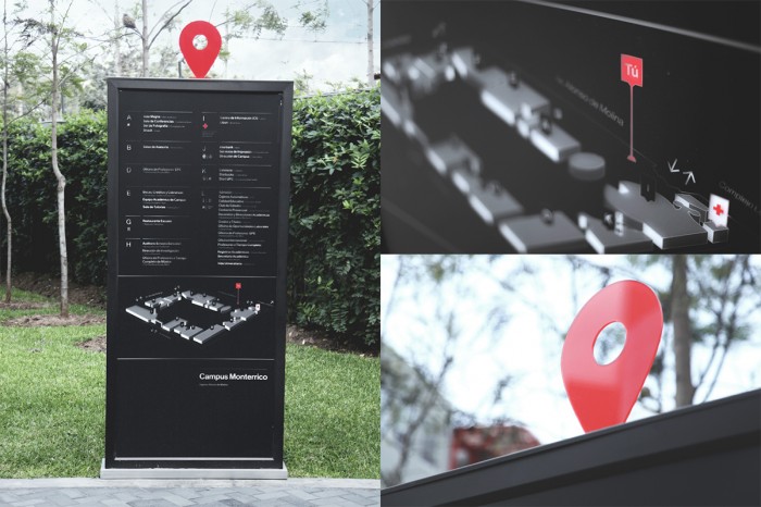
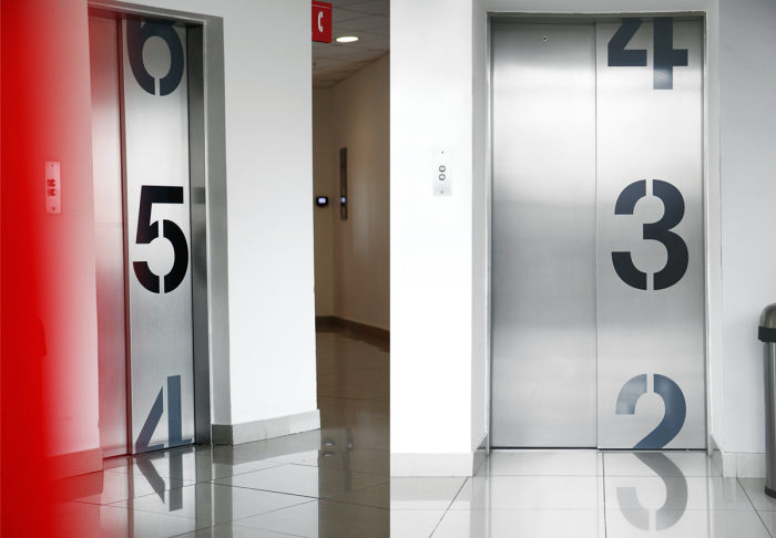
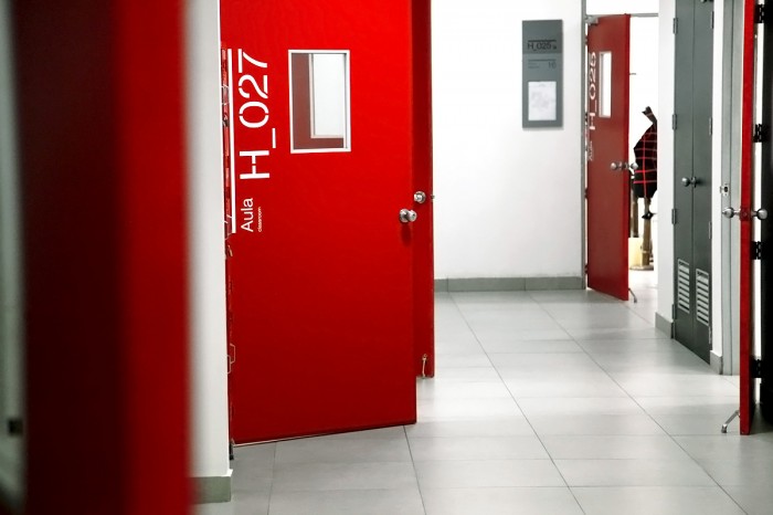
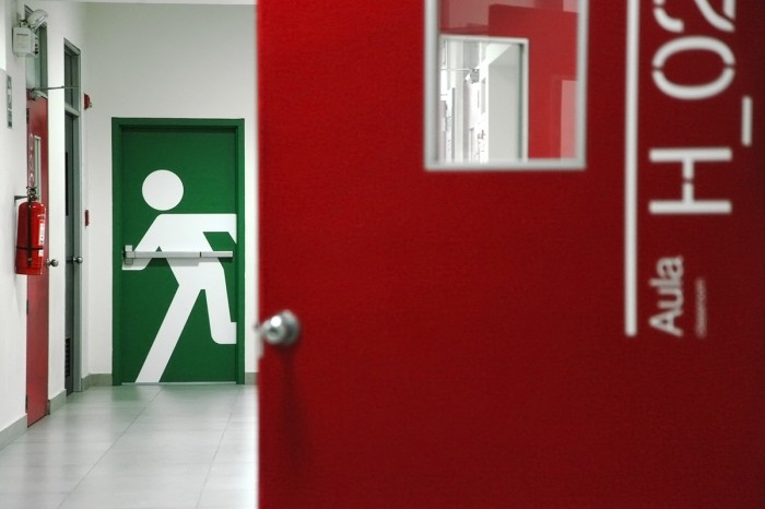
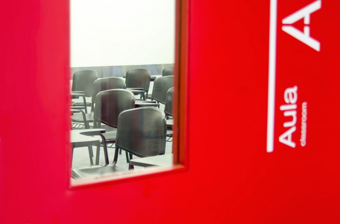
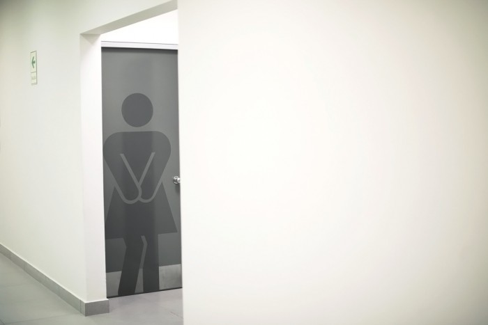
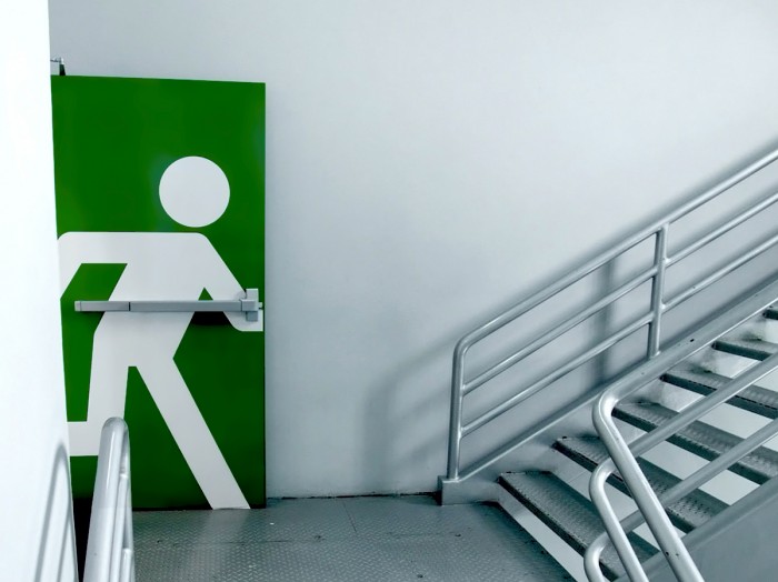
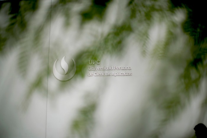
作为秘鲁应用科技大学(UPC)品牌重新设计的第三阶段,brandlab团队主要对大学标志和寻路展开规划设计。他们不仅生成有序的标识系统,还通以醒目和中性的大红色彩完成了校园和室内装饰的绘画。