今天我看见,
两个月亮,
一个新的,
一个旧的,
我很相信新月,
可我猜它是旧的。
[今天我看见],奥拉夫·赫格[挪威]
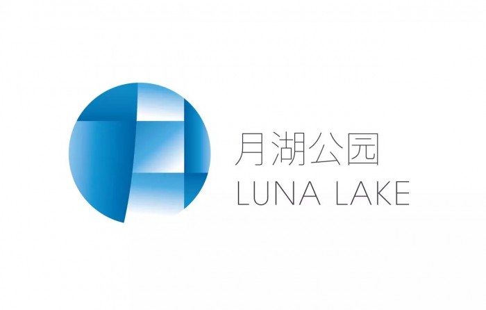
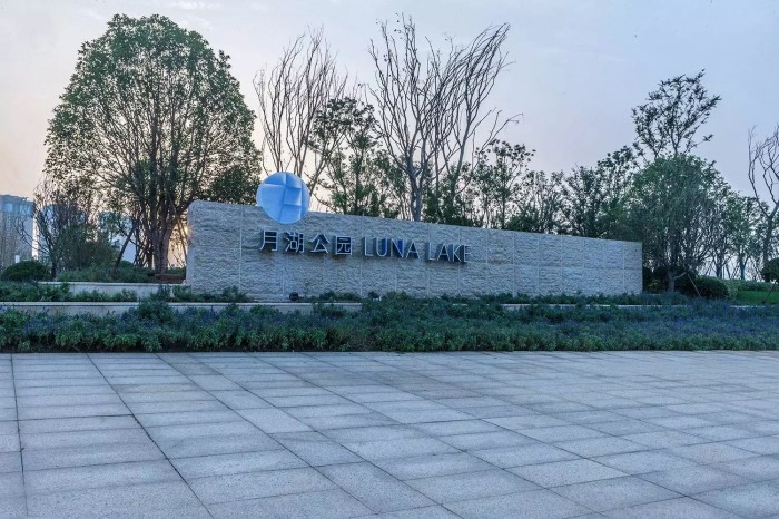
如同这首美丽的小诗,月湖公园就是这样一个浪漫、充满灵气的城中公园,它拥有一个月形湖湾,为城市增添了些许灵动,寄托着人们美好的憧憬。我们以汉字“月”为视觉核心,表现出城市中的这一弯月形湖水弥漫渐变的色彩,传递出皎洁晶莹的湖湾感受,这是能够打动人心的、具有启发性的设计。
Today I saw
two moons,
one new
and one old.
I have a lot of faith in the new moon.
But it’s probably just the old.
—“Today I saw” Olav H. Hauge
Just as this beautiful poem, Luna Lake is a romantic and sentimental city park. It has a moon-shaped lake in the center of it, decorating the city with soft yet vivid aroma. The branding design of Luna Lake takes the Chinese character “月” (meaning luna) as the key visual element, and the diffusing and gradual colors reproduce the visual feeling of the lake, enhancing the romantic atmosphere in the park.
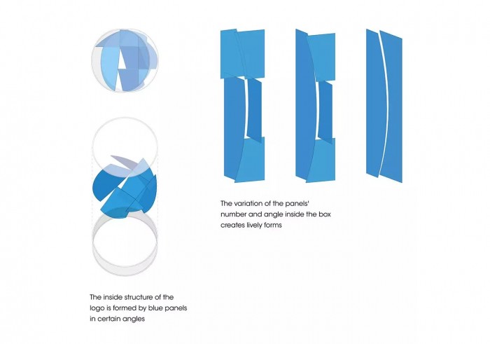
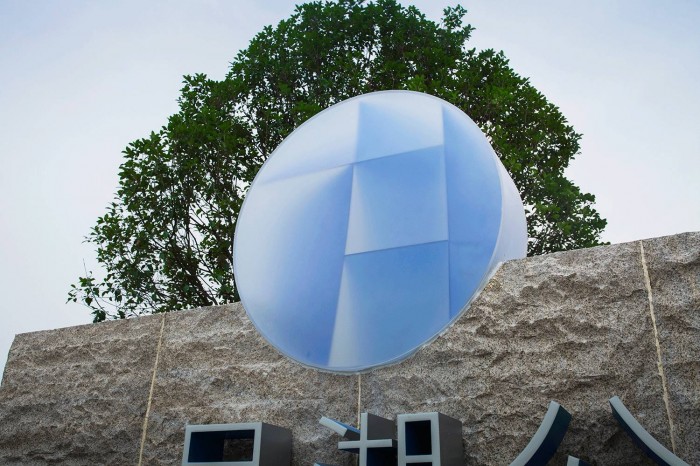
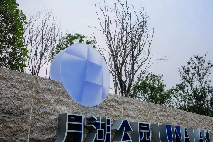
logo在公园里出现时,是通过磨砂树脂箱体内不同角度的色板组合构成的,均匀的蓝色板透过磨砂面呈现出丰富层次的变化效果,安静而美好。
When appearing in the park, the logo is a round box made of transparent frosted resin. What makes the box stand out is the blue panels inside of it that are installed in certain angles. The gradational lighting effect, created by thereaction of the box and boards inside, makes the logo a crystal moon, tranquil and beautiful.

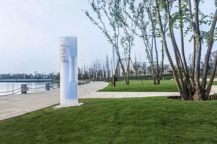
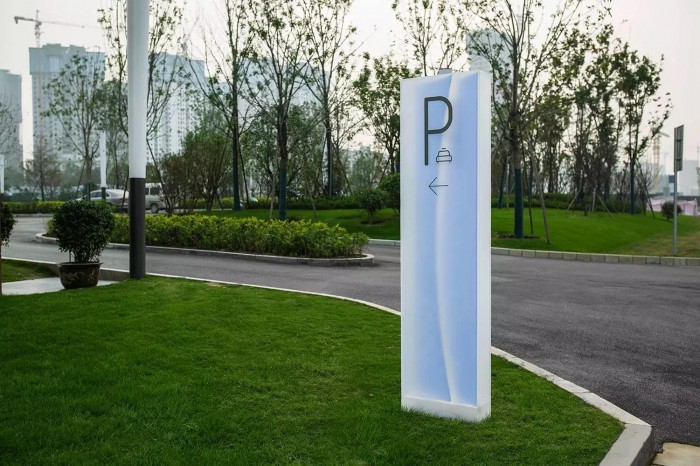
导示设计与logo一脉相承,色板的数量和角度变化形成了各种生动的状态,有的如月牙初生,有的则是logo中蕴含的汉字“月”。它通体轻盈,传递出具有弥漫感的视觉效果。如梦似幻,犹如精灵般散落在公园湖畔。
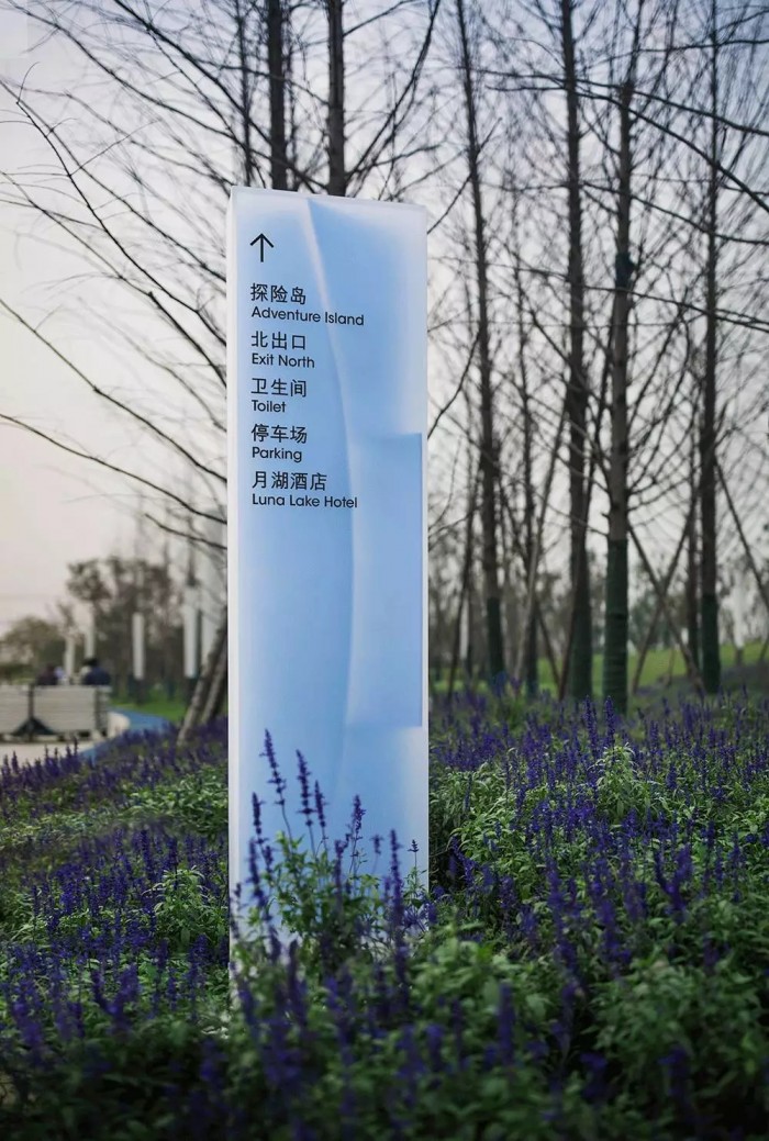
Signage design inherits the above concept: the variation of the panels’ number and angle within the box creates lively forms: crescent, character “月” ect. , As a whole, the signage are like fairies dancing in the air lightly.
项目:郑州月湖公园
地址:郑州惠济区
客户:郑州碧源集团
设计管理:于洋
设计单位:图石设计
设计师:何杨、张睿、刘文波、张琳娜、高金笑、蒋旭慧
制作单位:广东卡乐板实业有限公司、深圳西正标识
设计时间:2016.08
摄影:廖尚勇、何杨